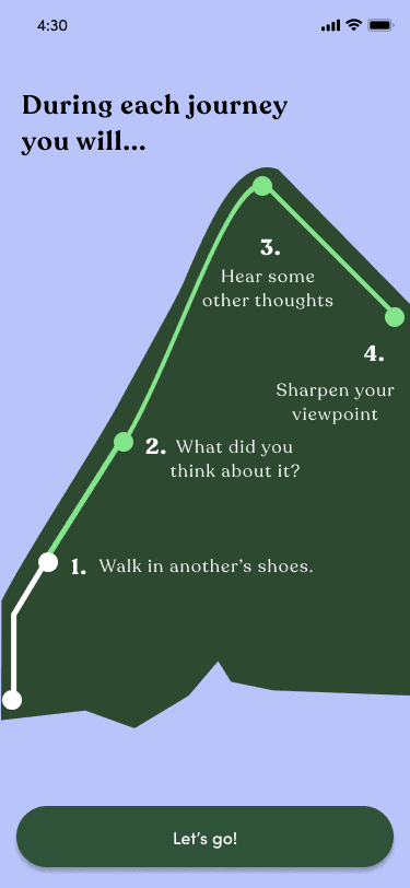
Final Design
Utilized logo in background
Emojis for lower lift
Created time passing with color + content
Line shape represents climbing mountain
Finalizing
I still needed to implement all of the constraints, so I thought about just implementing a transparent mountain graphic.
easy to read
time passing
use of emojis
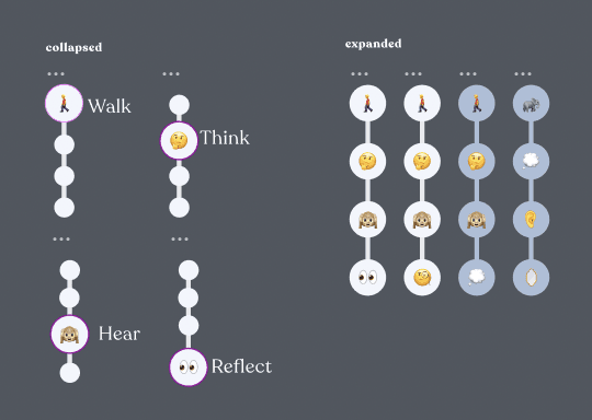
collapsable verson
mountain graphic
climbing a mountain
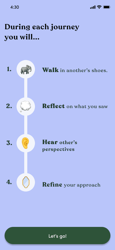
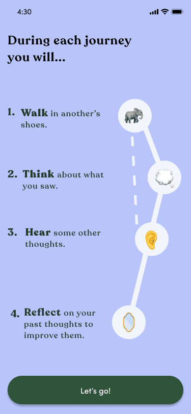
Goal 1: Implementing UI
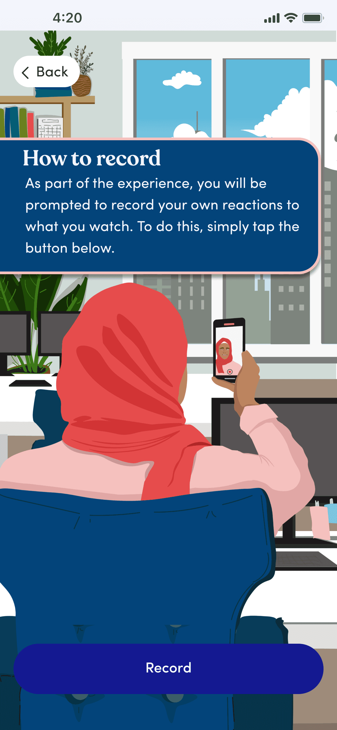
I was given a few key screens that were created from an illustrator. The company wanted to transform their UI to make the app more immersive, so every screen was interesting to look at and relatable to the content.
My goal: implement features of these illustrations into the user flow
The challenge: keeping the design simple and inviting
About The Project
Implement a new UI
Personalize content design for a launch with Deloitte
Enhance the long onboarding experience by minimizing confusion
Enhanced UI from the company's illustrator they were working with
Conducted daily meetings with the CEO to change the content of 70+ key
Created a user path to be implemented in the onboarding experience to make it clear of the user flow
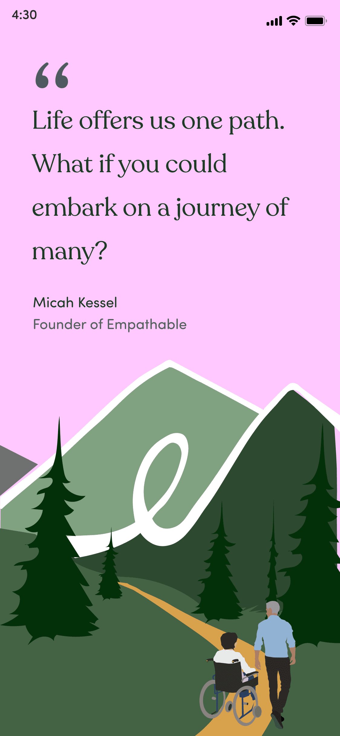
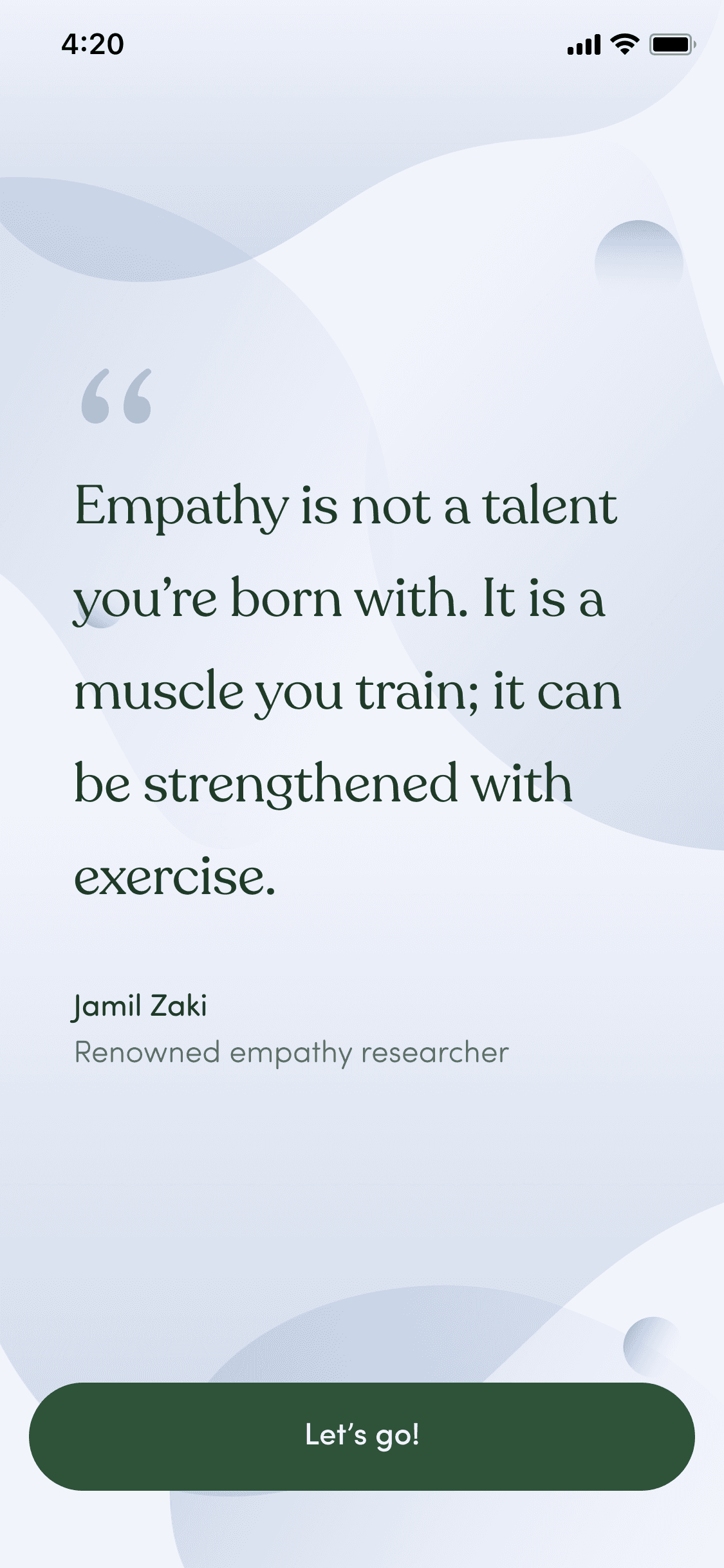
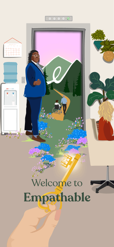
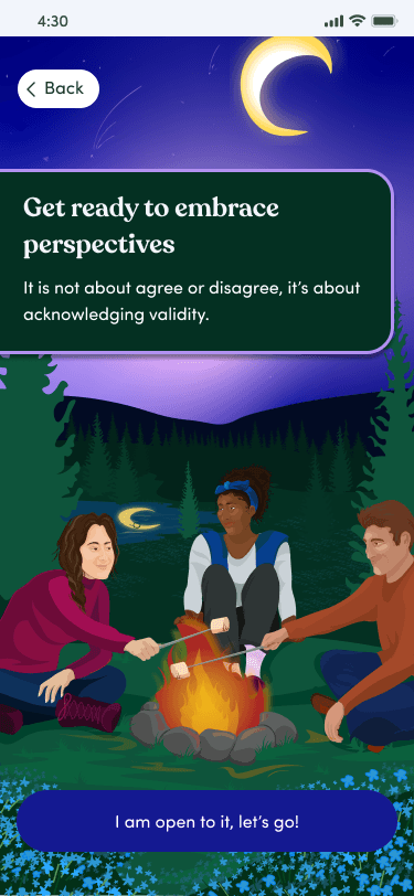
Empathable is a unique startup that provides a new way of HR training—through immersive videos, responses, and reflections. It is intended to provide insight into an underrepresented character and practice empathizing in the workplace by showing a conflict at work and having the user record a response.
Duration - 10 weeks
Tools - Figma, Slack, Ai
My role - UI UX Design, Content Design
My Goals
The Result
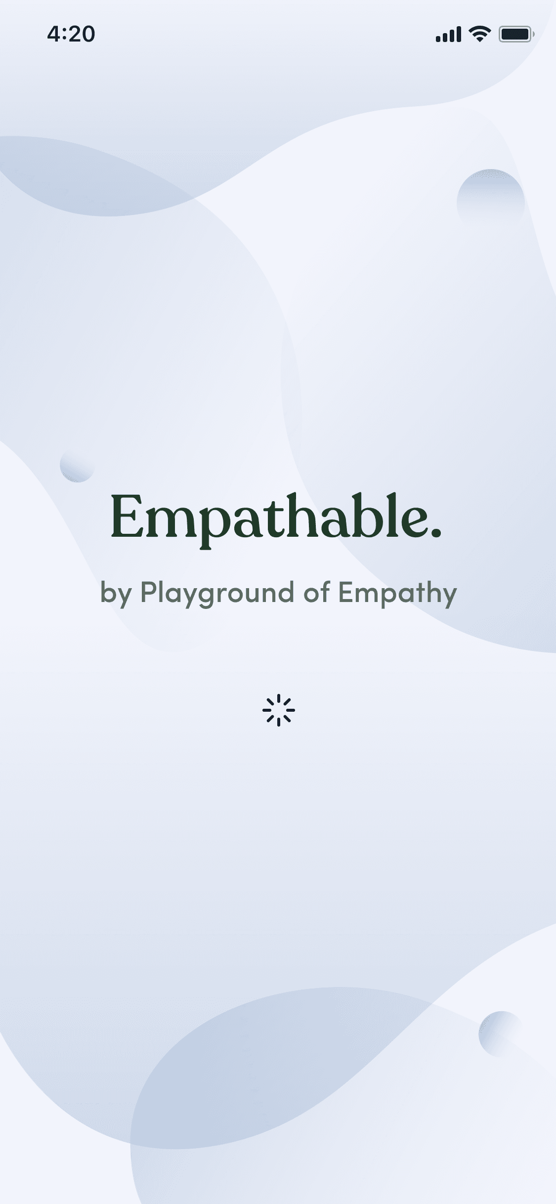
Empathable

Human Resources Services that offers immersive, point-of-view experiential videos that allow you to step into someone else's shoes.

Screens from illustrator
Empathable original UI
These key screens were the first in the onboarding experience. I wanted to implement the color palette from the illustrations while maintaining the simplicity of their original screens.
Finalized screens
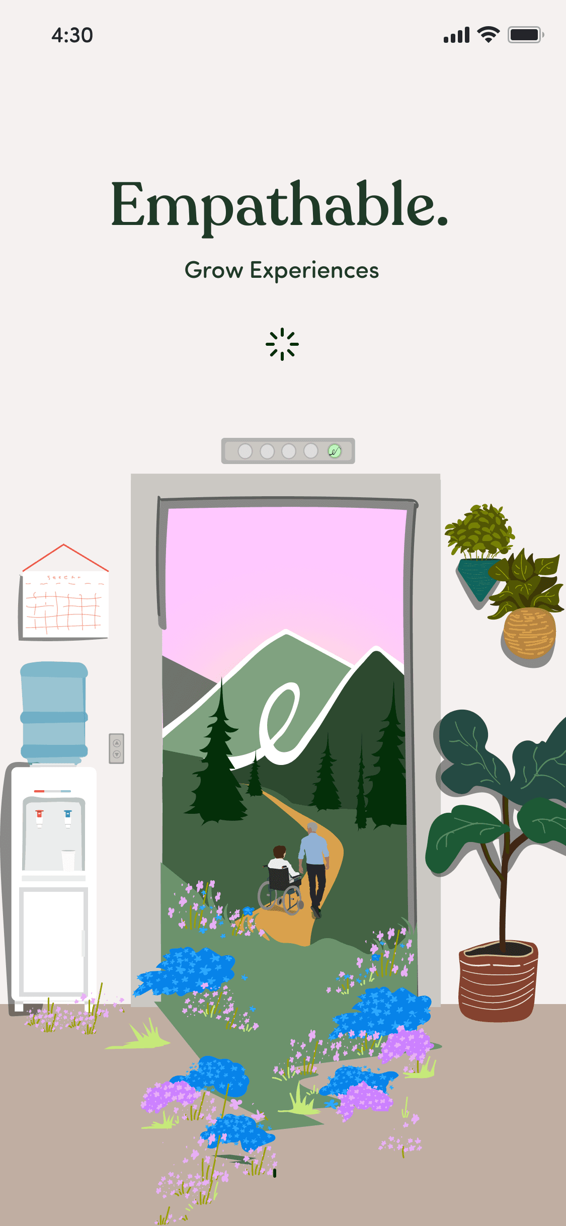
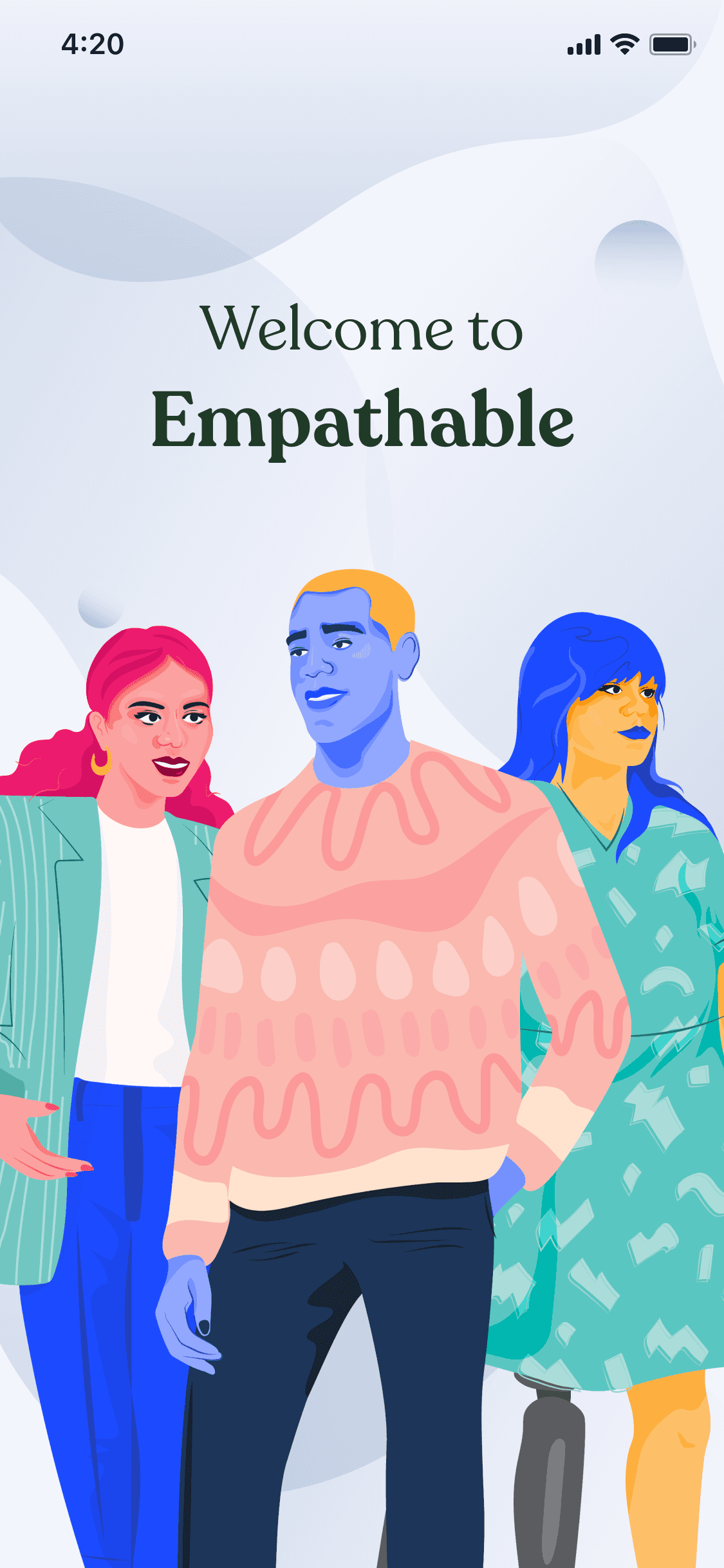
I wanted to emphasize the immersiveness of this UI as the loading screen is entering their app logo world.
This transition into the world of empathable was meant to start the users journey.
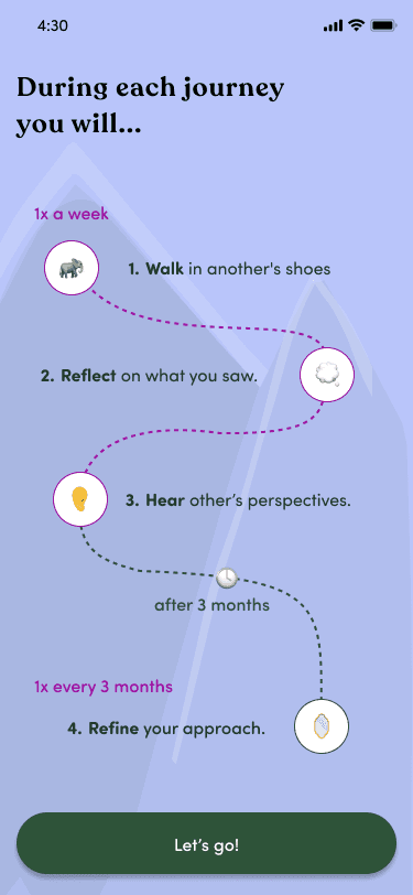
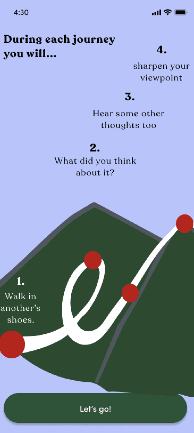
The CEO wanted something involving their logo and going on a path, so I decided to create a user journey.
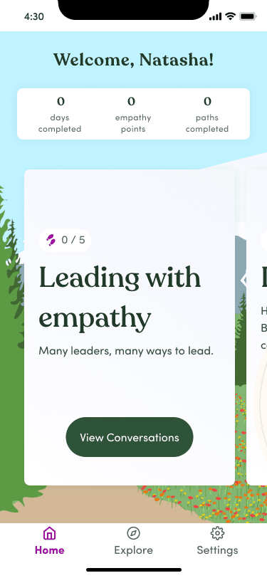
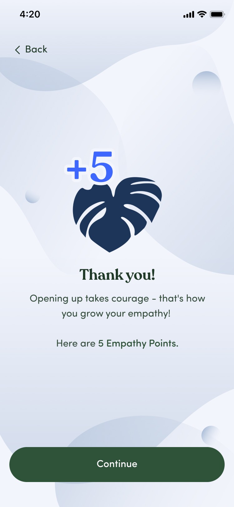
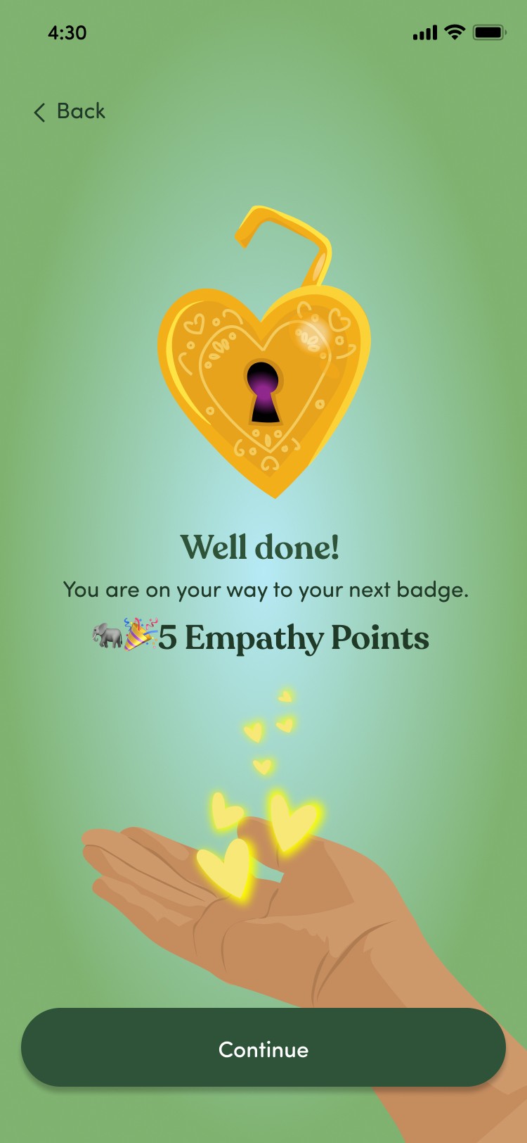
I wanted to create a really rewarding screen and highlight the empathy points in the middle with the gradient.
Enhancing the onboarding experience: User path
I created a user path onboarding screen to make it clear what the user was going to experience.
User feedback:
Unclear of what the app was about
Confused about what the onboarding process was for
Hesitant to record their perspectives
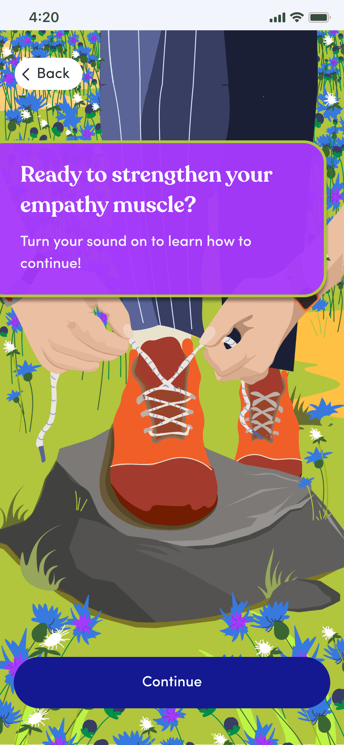
Constraints:
Low lift for the developer
Use of emojis instead of graphics
Must include mountain graphic from Empathable Logo
Implementing time passing
Creating a path of climbing a mountain
Create a collapsable version to show smaller on future screens

🚶♂️🐘
👂🪞
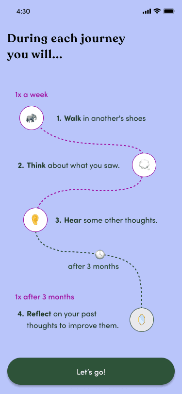
Iteration process
Things I kept in mind: low lift, simplicity, time passing, and relation to a mountain.
Note: The CEO first intended this to be used later in the user journey, so I had to think of a collapsible version.
Mountain graphic
I first just iterated on the mountain graphic and tried to divide the graphic based on the user path.
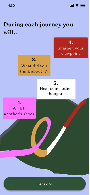
Adding content
mountain graphic
climbing a mountain
collapsable version
easy to read
time passing
use of emojis
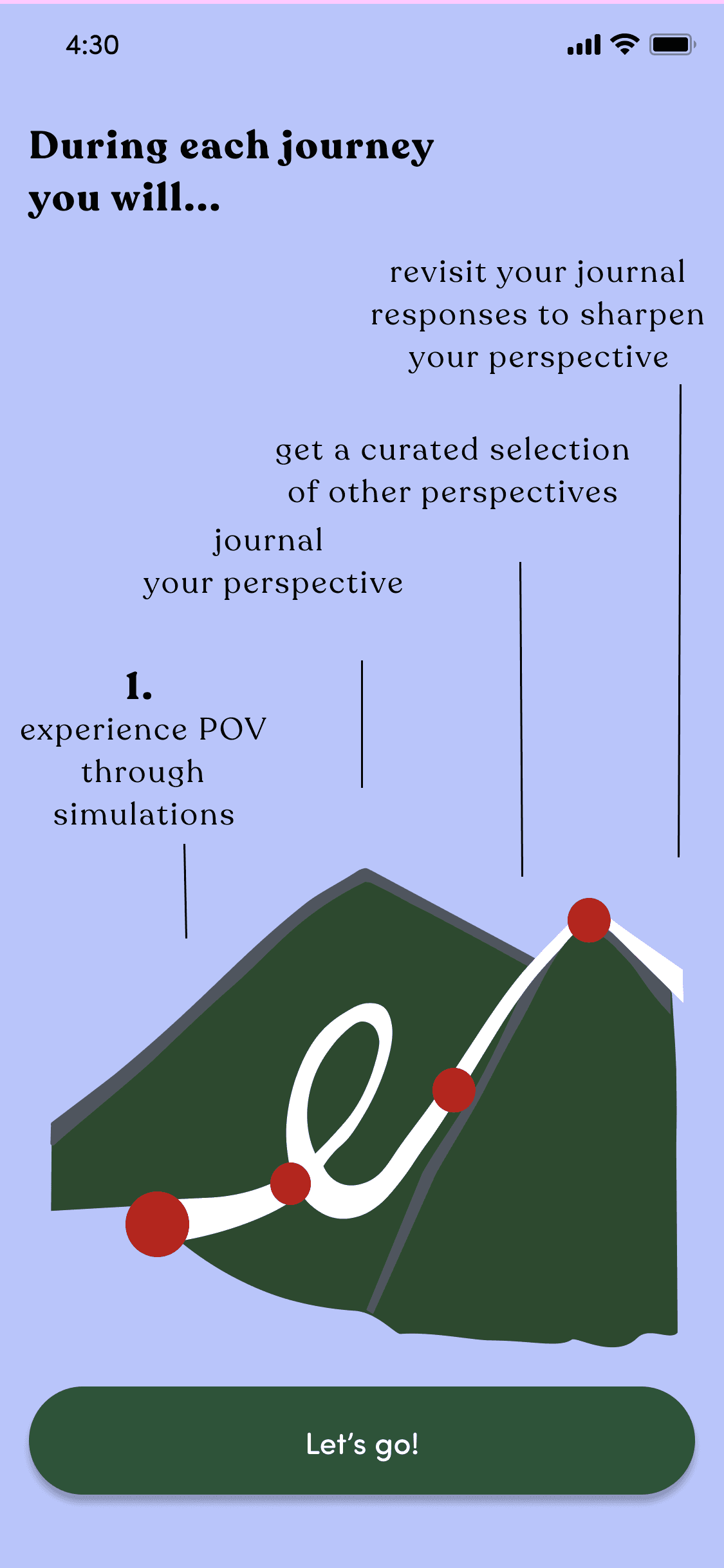
Simplifying the design
I just wanted to visualize the content without the mountain graphic and tried and create mountain with the path.
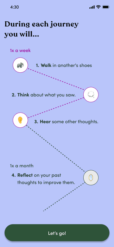
mountain graphic
climbing a mountain
easy to read
time passing
use of emojis
collapsable verson
The company really liked this version!
Login
Onboarding questions
Video
Recording perspective
Browsing paths
Reflecting on users recordings
Recording perspective
Watching videos
Selecting path
wanted to minimize confusion by previewing the user journey after the login
User Journey
Initial download
Key Takeaways
When working with a company, if you disagree with their design it is still valuable feedback for them.
The use of graphics this intense in Figma was daunting, but a very rewarding process.
Working consistently with a software engineer was a valuable experience, and learning what was considered "low lift" is such an
important part of changing the design before a major launch.